Brilliant Iteration

The wonderful thing about design concepts and patterns is that they can be reused. Whenever you hit on a core idea, it can be expanded to many different applications.
Recently, Apple has introduced Force Touch or haptic feedback into their products.
On the iPhone, as you press harder, you get a slight buzz on your finger and then a contextual menu pops open for a given app. As well as a feature called “peek and pop” that allows, on a harder press, the app to render a bubble with a contextual preview.
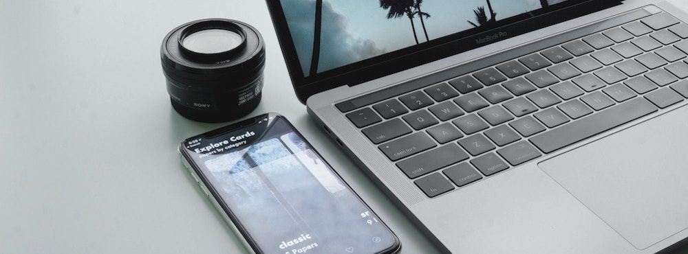
On the Mac, when you “click” something, the trackpad feels as if you are pushing it down, but it’s not moving. The click sound is coming from the speakers. It is tricking your brain into thinking that there was a click.
For now, this is just on the touchpad, which is one button. However, it could be used for the entire keyboard (mirror) as well.
On the Magic Touchpad, again, when you “click” something the trackpad feels as if you are pushing it down, but nothing moves. The old trackpad had to be on a flat surface to work as it was one giant button when pressed down onto it’s base. Now nothing moves, it too has a built-in speaker and artificially makes a clicking noise.
On the Apple Watch, if you use the digital crown to scroll too far up or down, it vibrates in a way that mimics the way a crown on a watch will spring back when wound too far.
I love the subtleness of this.
I love that there is a company that cares about the details enough to try this.
Pundits act like Apple has changed drastically since Steve Jobs passed. In fact, Apple has remained true to itself. They have remained true to design.
The small details really do add up to the overall user experience.